Cosine Similarity: Visualization
Why do we need this blog?
For an ML researcher, the most desirable skill to have is storytelling with good visualizations. Even when we do the most amazing work with all the fantastic techniques available for ML/DL, all might go in vain if we can’t convey the findings in the most simplest way possible.
So, This article is about a possible solution for understanding cosine similarity as simple as way.
Note - This post does not talk about intricate details of cosine similarity’s working. In case if you are here for it, please feel free to check out this link - Cosine similarity - Understanding the Math
What does mean by cosine similarity?
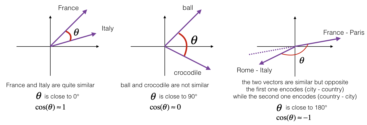
Cosine similarity is a metric used to measure how similar the documents are irrespective of their size. Mathematically, it measures the cosine of the angle between two vectors projected in a multi-dimensional space. The smaller the angle, higher the cosine similarity.

Problem statement
To begin with the solution, we need a problem statement. Since we are trying to undestand cosine similarity, we can check on semantic similarity of words in vector space.
Vectors are the numerical representation of words in multi-dimensional vector space which helps to perform various manipulations with and around the data.
I have a list of words related to clinical domain to which we are going to work on semantic similarity using cosine distance.
List of words :: ['Syringe', 'oral liquid', 'Cream', 'oral suspension', 'Inhaler', 'vial', 'injection', 'Tablet', 'ampoules', 'ointment', 'Syrup', 'oral solution',
                 'Liquid', 'suspension', 'Capsule', 'solution']
I’m using pre-trained model to get the vector representation of these words so that we can go ahead and find semantic similarity of them. I have chosen ClinicalBERT to find vectors for our example as it suits the data very much.
You can check more on clinicalBERT Embeddings by following this Paper.
from transformers import AutoTokenizer, AutoModel

words = ['Syringe', 'oral liquid', 'Cream', 'oral suspension', 'Inhaler', 'vial', 'injection', 'Tablet', 'ampoules', 'ointment', 'Syrup', 'oral solution', 'Liquid', 'suspension', 'Capsule', 'solution']

# create all possible pairs
pairs = []
# create a list of tuples
for i, v in enumerate(words):
    for j in words[i+1:]:
        pairs.append((words[i].lower(), j.lower()))
# initialize tokenizer and pre-trained model from hugging face
tokenizer = AutoTokenizer.from_pretrained("emilyalsentzer/Bio_ClinicalBERT")
model_clinical = AutoModel.from_pretrained("emilyalsentzer/Bio_ClinicalBERT")
word_vec = model_clinical(torch.tensor(tokenizer.encode(word1)).unsqueeze(0))
print(word_vec)
sklearn library
# cosine similarity - function
def cosine_similarity_vectors(pair):
    word1, word2 = pair
    vec1 = model_clinical(torch.tensor(tokenizer.encode(word1)).unsqueeze(0))
    vec2 = model_clinical(torch.tensor(tokenizer.encode(word2)).unsqueeze(0))
    cos_sim = round(cosine_similarity([vec1['pooler_output'][0].detach().numpy()], [vec2['pooler_output'][0].detach().numpy()])[0][0], 2)
    return cos_sim
# compute cosine similarity for each pair
cosine_similarity_value = []
for pair in pairs:
    pair_lst = list(pair)
    pair_lst.append(cosine_similarity_vectors(pair))
    cosine_similarity_value.append(tuple(pair_lst))
Thus, the cosine similarity of all pairs are computed and we are storing it as list of tuples in the following format
Correlation Plot
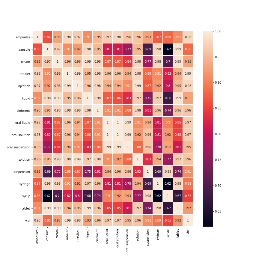
Correlation plots can be used to quickly find insights. It is used to investigate the dependence between multiple variables at the same time and to highlight the most correlated variables in a data table. In this visual, correlation coefficients are colored according to the value.
Before getting on to the plotting, we need to prepare data in such a format that can be accpeted by correlation plotting function of seaborn library
tags = []
for t1, t2, _ in cosine_similarity_value:
    tags += [t1, t2]
tags = index = columns = sorted(list(set(tags)))

tags = dict((t, i) for i, t in enumerate(tags))

correlation = np.identity(len(tags))
for t1, t2, corr in cosine_similarity_value:
    correlation[tags[t1]][tags[t2]] = corr
    correlation[tags[t2]][tags[t1]] = corr

df = pd.DataFrame(correlation, index=index, columns=columns)
Now that we have data ready to be plotted, we proceed with plotting the data using heatmap function from seaborn library.
fig, ax = plt.subplots(figsize=(12,12))
sns.heatmap(df, annot=True, linewidths=.5, ax=ax)
The plot signifies different similarity scores between pair of words by a spectrum of color.
 In our case we can easily see the semantic similarity of tablet-capsule is higher than tablet-syrup.
Thus, it is evident from the above example that correlation plots serves as a tool in understanding cosine similarity related works.
